
Jump To:
Scraping and Analyzing
Data Cleaning and Considerations
Creating the Maps
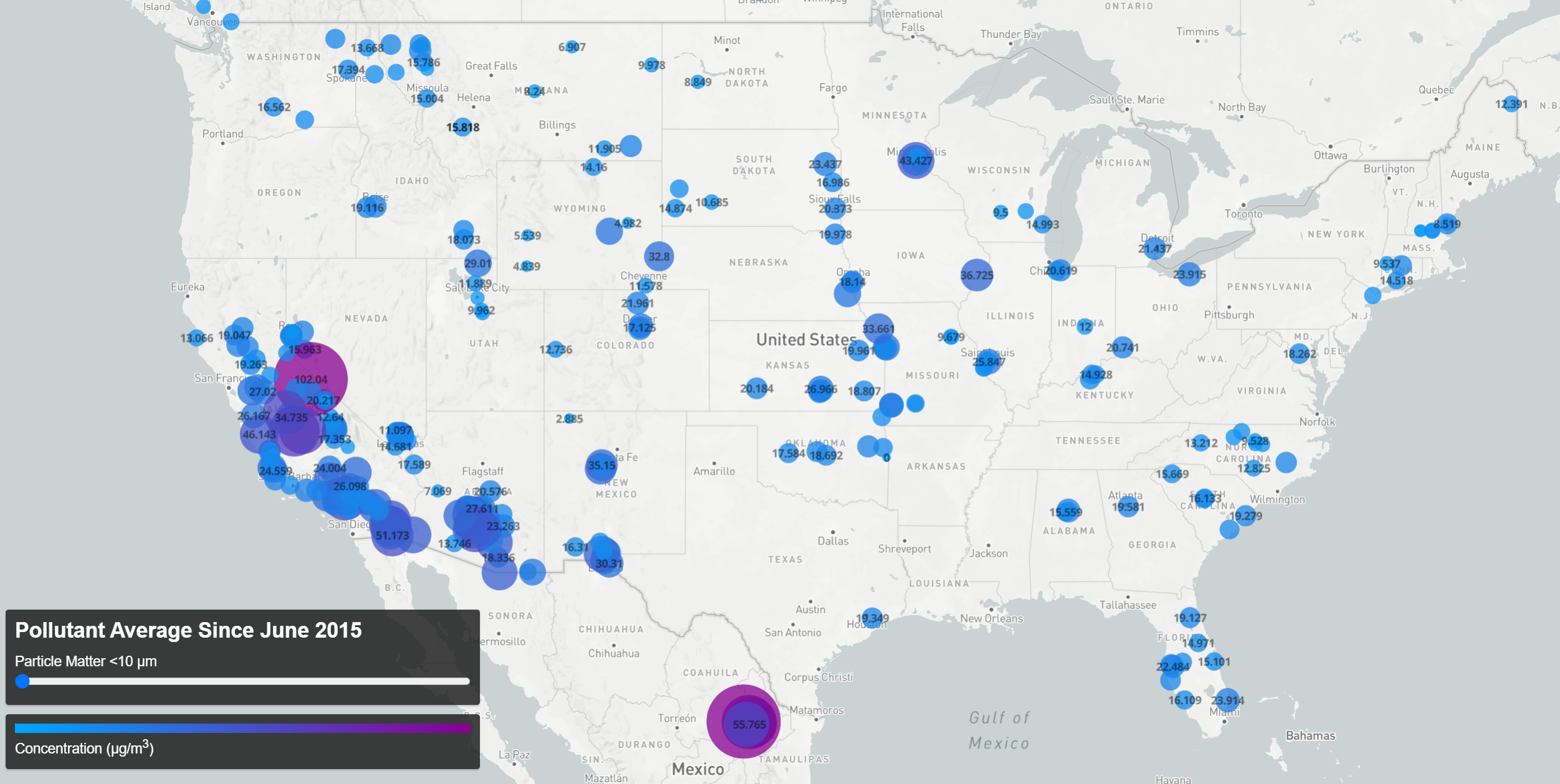 Pollutant Concentration Averages Since 06/2015 (click the map for an interactive version)
Data does not tell its own story. My graduate thesis project, towards which I worked meticulously for over five years, essentially boils down to around 8 billion numbers in various arrays. The mere record of these numbers would surely not have persuaded my thesis committee to grant me my PhD. The point is, of course, not that I have the numbers, but what the numbers mean: These numbers, in this arrangement, arriving in this order means– something. It’s a human task to turn data into information.
A few weeks ago I found a database of air quality measurements from locations around the world. The data, available at OpenAQ, offers almost daily data going back to June of 2015. I decided to create a map to visualize this data to get a sense of what the mountain of spreadsheets had to show. I had never built a web scraper before, so I took this as an opportunity to learn a few new skills.
Scraping and Analyzing
The key to writing a program to download the right files comes down to getting an array of the file names. Here I used the Python package BeautifulSoup to parse the page. In this case, the CSV files were given <key> tags in the site HTML, making them easy to pluck out.
def find_csvs(url):

        r = requests.get(url)
        soup = BeautifulSoup(r.text, "html.parser")

        csv_names = []
        for f in soup.find_all('key'):
            string = str(f)
            name = string[5:len(f)-7] #remove <key> and </key>
            if name[len(name)-3:] == "csv":
                csv_names.append(name)

        return csv_names
After some slight string editing I’m returned a string array of CSV names and can download them easily.
With the data on hand, the question becomes how best to present it. In this case I think there are two natural questions that arise. First, how does air quality differ from place to place? And second, how does it vary in time? To answer the first question, the data was aggregated into a single file, creating an average of all records taken at each location for each pollutant (“aggregate-average”). For the second, I chose to group the data by month so as to produce an average concentration per pollutant per location per month (“monthly-average”)- this choice was made to increase the amount of data available (as not all locations reported data daily) while still maintaining an appreciable number of temporal bins over which to view changes concentration levels.
These monthly and aggregate averages were computed in Python, and the following code snippet highlights the important aspects of the data processing:
for ym in month_csvs: #for each month

    #find daily csv files from that month
    relevant = []
    for file in csvs:
        if ym[:7] in file:
            relevant.append(file)

    #create one dataframe for the month, dropping duplicates to create unique parameter/lat/long entries
    all_month = pd.concat(pd.read_csv(csvdirec+r,usecols=col_names) for r in relevant)
    #drop duplicates
    sub =['parameter','latitude','longitude']
    month = all_month.drop_duplicates(subset=sub)
    unique_rows = np.arange(len(month['location']))

    #update each unique entry with average of monthly measurements from that location
    for r in unique_rows:
        mrec = all_month[ all_month[sub[0]] == month[sub[0]].iloc[r] ]
        mrec = mrec[ mrec[sub[1]] == month[sub[1]].iloc[r] ]
        mrec = mrec[ mrec[sub[2]] == month[sub[2]].iloc[r] ]
        av_val = np.mean(mrec['value'])
        month['value'].set_value(r,av_val,takeable=True)
        month['year-month'].set_value(r,ym[:7],takeable=True)
        month['num_records'].set_value(r,len(mrec),takeable=True)

    month.to_csv(fsav,index=False)
This process creates one file for each month, accomplished in two steps. First, a dataframe is created that only consists of unique parameter/location pairs (month_data in the above code). Then all the records taken that month of that parameter at that location are assembled (multiple_records above). This is used to compute the average recorded value for the month and the value is updated in the month_data dataframe. By also keeping track of how many records were used to compute each monthly average, I can then find the aggregate-average by combining the monthly files and compute the weighted average of the monthly values for each parameter and location.
Data Cleaning and Considerations
There are a few things about the data that need consideration, both to clean it and to present it in a useful and appealing way. First, there are entries lacking latitude/longitude information. These are avoided with a simple call to drop any rows containing NaN values. Second, there are numerous entries throughout the dataset that contain negative concentrations (which obviously do not reflect the actual pollutant levels). OpenAQ responded to my query regarding this by stating that they archive the raw data recorded by each location and do not correct for any instrument drift or periods of instrument malfunction. This being the case, for the purposes of this visualization I simply ignored negative values. The last cleaning step is a simple unit conversion, converting from ‘parts-per-million’ to ‘µg/m³’ as needed to create a uniform dataset.
In addition to using a color scale to show the levels of concentrations, the radius of the circles is also set by the concentration value. This code snippet shows how this quality is set:
'circle-radius': {
    property: 'value',
    stops: [
        [0, 5],
        [100, 40]
    ]
}
Thus a value (concentration) of 0 results in a 5 pixel radius and increases to 40 pixels at a value of 100. A look at the raw data explains my choice for these settings.
Plotting the raw data (sorted) reveals the majority of the data is grouped at 1000 ppm or below, but due to the huge range of the outliers, setting the marker radius to the maximum value in the data would result in nearly identically sized markers (all essentially the minimum marker size), drastically reducing the amount of information conveyed in the visualization.
 In order to aid in the decision of where to set the upper limit for marker size, it is helpful to view a histogram of the data (note that the bin sizes vary).
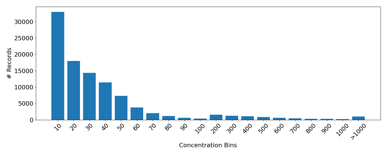 From this it is apparent that the number of records falls off with higher concentrations as expected. Moreover, ~92.5% of the records fall below a value of 100. For this reason I chose 100 as the upper stop for the map marker radius.
Creating the Maps
I created the map visualization using the Mapbox API which required converting the data from CSV files into a geojson format, accomplished using this online converter tool. The map style was formatted following this example. The visualization of the aggregate data (above) required a simple filter applied to the slider setting that displayed only the data for the pollutant selected (mainly to avoid the overlapping icons that would result from displaying multiple pollutant records at each location).
document.getElementById('slider').addEventListener('input', function(e) {
    var iparam = parseInt(e.target.value, 10);
    filterBy(iparam);
});
The variable is passed to the function filterBy that applies the filters to the map and displays only the relevant data.
function filterBy(iparam) {
    var filter = ['==', 'parameter', params[iparam]];
    map.setFilter('pollution-circles', filter);
  }
A difficulty arises, however, when trying to map the monthly data. Applying a second filter suffices (wherein one selects data of the correct month, another data of the correct parameter), but due to the size of the geojson file containing all the monthly data, these filters slow down interaction with the map considerably. Instead, separate geojson files were created for each pollutant and introduced as separate map layers. An array of menu buttons is used to toggle the visibility of these layers (while still allowing only a single parameter to be visible at once). Not only does this speed up load times, it also affords the opportunity to adjust the circle-radii individually for each parameter. So whereas the map above simply shows concentrations for the pollutants, I can add some subtlety to the monthly plot by incorporating a human factor.
Using the Air Quality Index converter from AirNow, I use an AQI level of 100 (the border between moderate and unhealthy levels) to compute a maximum circle radius for the each parameter. These limits are:
CO (8hr average)-9.4ppm
03 (8hr average)- 70ppm
PM2.5 (24hr average)- 35.4ppm
PM10 (24hr average)- 154ppm
SO2 (1hr average)- 75ppm
NO2 (1hr average)- 100ppm
For each parameter I then set the circle-radius maximum to the corresponding concentration. It is the case, though, that most of the records fall far below this danger level. So in order to embellish the variation at concentrations far below an unhealthy level, I set three stops for the circle-radius property. For ozone, this gives;
'circle-radius': {
  property: 'value',
  stops: [
    [0, 5],
    [100,30],
    [78680, 40] //70ppm
  ]
}
Now having tied the numbers to actual human health factors, we change the color scale. It’s a stylistic choice, but since human health is involved, having the color red indicate danger seems appropriate, and blue and green seem like fine choices to indicate low, healthy levels.
The resulting map is below and shows how pollutant concentrations vary in time for each location.
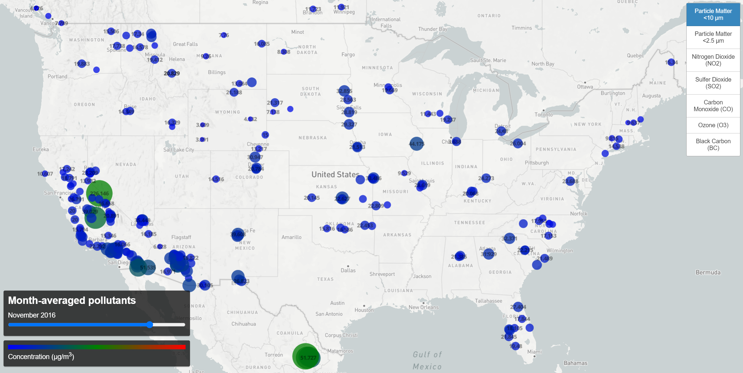 Monthly Pollutant Concentration Levels (click the map for interactive version)
So here we have both maps working, giving us a visual understanding of the two questions posed earlier- one to show how concentrations vary around the world, another to show how those levels vary with time.