Jump To:
The Project
4D Visualization of Data
Back when I was doing gig work, I completed a project for an Upwork client optimizing parameters in a time-series analysis. I thought both the project itself and the subsequent task of communicating the results through visuals presented some interesting material, and so I wanted to briefly mention a few things here.
The Project
My client’s goal in hiring me was to increase the success of his stock trading by using the moving average convergence/divergence (MACD) technique. This technique computes three exponential moving averages (EMA) based on three time windows (a,b,c), which is supposed to reveal changes in the strength, direction, momentum, and duration of a trend in a stock’s prices.
Developed in the 1970s, this technique is typically computed with time windows of 12, 26, and 9 days. This represented two weeks, one month, and a week and a half of the old 6-day trading cycle. As today’s stock prices are updated in near real-time there is much more flexibility in the choice of time window parameters.
Steps to the analysis are as follows:
- Compute two exponential moving averages, EMA(a) and EMA(b) of the closing stock price
- Calculate MACD = EMA(a) - EMA(b)
- Compute EMA(c) of the MACD time series
- Calculate a ‘Histogram’ = MACD - Signal
As each EMA value depends upon the one preceding it, the first EMA value is computed as an average of the closing price over a period matching the time window parameter. An example of the results of this analysis is shown below.
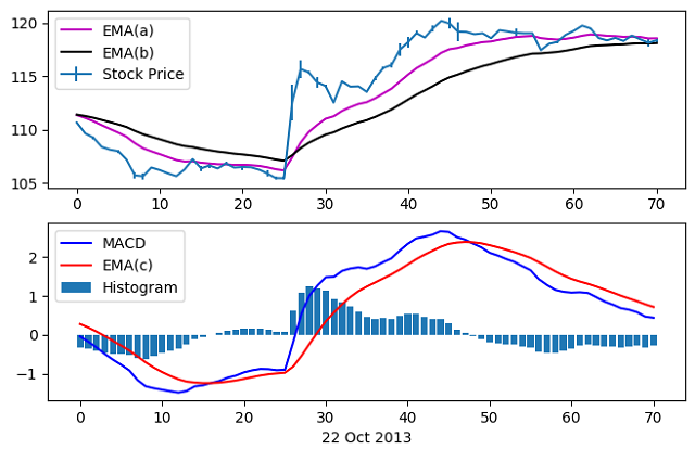 These time series are then used as trading indicators, with ‘buy’ and ‘sell’ signals triggered by some event in the data (a zero-crossing, for example, or a certain drop in price or volume).
The client provided me with roughly three years of stock price data for two stocks. This included an ‘open’, ‘close’, ‘high’, and ‘low’ price and ‘volume’ for each entry, with entries at 5 minute intervals between 9:30am and 4:00pm. The goal of hiring me for this project was to optimize the time window parameters (a,b,c) to maximize an investor’s return on investment (ROI). To assess the ‘goodness’ of a set of parameters, I model how an initial investment would change given the client’s buy/sell criteria applied to the signals generated for those parameters.
For this work the three year dataset was broken up into a 2-year ‘in-sample’ and 1-year ‘out-sample’ set. This allowed us to perform the optimization on the in-sample and see how it would perform on data for which it was not optimized. The following two plots show examples of the results on a small (and hopefully digestible) scale.
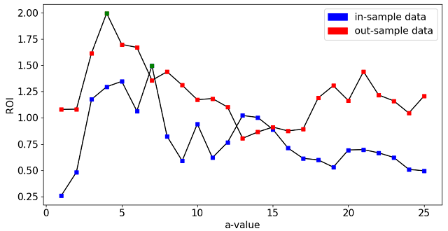 Scan of ‘a’ parameter on in/out-sample data
After scanning over a single parameter we apply the investment model to calculate the ROI for each value of a on both the in- and out-sample data. The optimization on the in-sample data (green marker) gives an ROI of 1.5, falling to 1.36 when applied to the out-sample data. While not a bad return, it is noticeably not the best we could have done with the out-sample data.
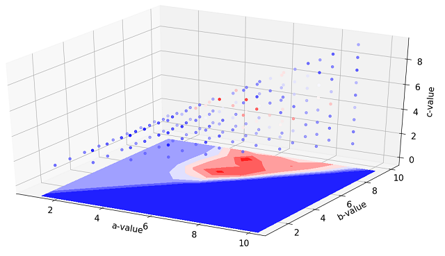 Small scan of (a,b,c) parameters
We now scan over all three parameters, given the constraint that c <= a < b. By allowing variation in all three parameters, we are able to increase the ROI on in-sample data up to 3.08 with optimized parameters of (a,b,c) = (5,9,4). Applied to the out-sample data however, the ROI falls to 0.93.
The actual analysis was conducted over a much larger parameter space. Although stock volatility makes this analysis far from guaranteed to increase profit, the optimization here did result in a 32.3 and 51.9% increase in ROI on the out-sample data when compared to the “standard” analysis parameters of (12,26,9) conducted on the two stocks. While smaller sample sizes can be fairly effectively visualized as shown above, the much larger datasets created through the full 3D parameter scan are more difficult to portray in easily understandable formats. This is the motivation for the second portion of this post.
Visualization of 4-dimensional Data
The fundamental difficulty of plotting 4D data is of course that we assign a physical dimension to a dimension of the data, and are left with one extra data dimension with no obvious choice for how to represent it. Color is a common choice, as demonstrated above. The difficulty for this analysis arises from the large amount of data to be represented in the real parameter optimization.
The time windows considered for this analysis were set by 1 <= c <= 78, where 78 (given the 5 minute increment in stock data) represents one day of trading. Parameters a and b are constrained as mentioned above. This gives a parameter space consisting of 79,079 data points. While not a large dataset by any means, representing 79,079 different ROI values visually while depending on three input parameters is very difficult. Using the same color scheme as above results in the data being so tightly packed that it is very difficult to see inside the boundary.
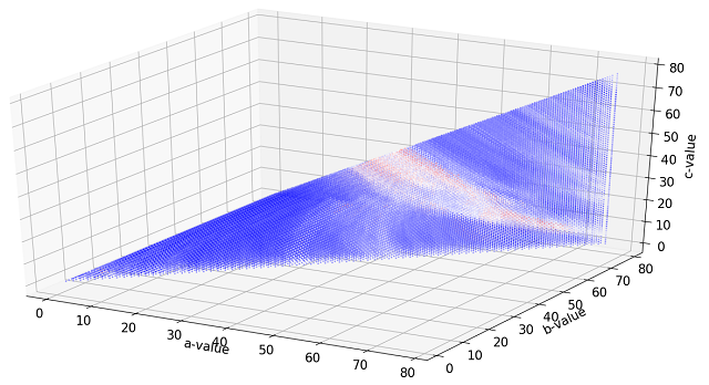 Color scale plot of 3D scan of (a,b,c) parameters
By flattening one of the dimensions (in this case by keeping the maximum value) we can include 2D color plots alongside the one shown above to get a sense for the internal structure. By including more information in more plots, however, we complicate the visual and make it more difficult to digest.
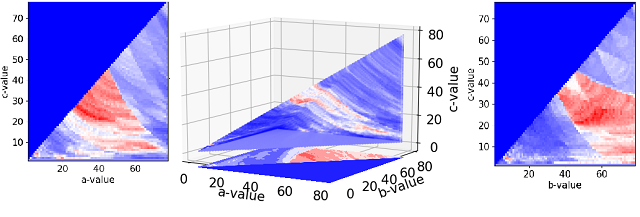 Contours of flattened data reveals information on internal structure
One way to clarify the visualization is to include another dimension, namely time. Instead of flattening one dimension as above, we prescribe that variable to the time axis. So now we have the four quantities we’re trying to plot (a,b,c,ROI) assigned to four axes (x,y,z/time,color).
Scanning parameter 'c' vs time
We can make another interesting visual by mapping the ROI value to the time axis instead of the time window ‘c’.
Plotting normalized ROI vs time
Finding useful, concise, and clear methods to convey 4D data is a common challenge. Any measure of a 3D object (the human body for example) results in 4D data, and a good representation of the data is often more of an art than a science.
